Jason Hawkes Photography
Some seriously good photography here. Some of the aerial shots over London are great.
Via: The Real Gent
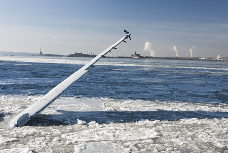
In The Unlikely Event of a Water Landing
The Unlikely Event of a Water Landing: New Photos From Flight 1549: “On Jan. 15, 2009, a few Canadian geese with bad timing became snarge, a steely pilot became a hero, and the world became fascinated with images of a jet splashing into the Hudson River and then floating calmly as passengers crowded its wings.
But until now, few people have seen the equally surprising pictures of the second half of this story: when a salvage team used the biggest floating crane on the East Coast to pluck the ill-fated Airbus A320 from the frigid water.”
An incredible set of photos! There’s also an interesting story behind the images in the article.

WhatTheFont for iPhone
MyFonts’s excellent WhatTheFont tool is now available as a free iPhone app:
Ever seen a great font in a magazine ad, poster, or on the web and wondered what font it is? Whip out your iPhone and snap a photo, and WhatTheFont for iPhone will identify that font in seconds!
Works great in my quick testing. (Via Swiss Miss.)
”
(Via Daring Fireball.)
Aerial Virtual tour of New York
No idea how they did this but well worth spending a few minutes having a look at this!
Aerial Virtual tour of New York
(Via Chase Jarvis.)
Horne and Corden’s BBC show is not something to celebrate
Wow, I feel exactly the same way about this terrible show!
Horne and Corden’s BBC show is not something to celebrate
“I may not be in BBC3’s target audience, but I do know what funny looks like – and lame homophobic material and a fat bloke baring his flabby belly every 30 seconds simply doesn’t make me laugh. Besides, if that’s what BBC Three producers think their target audience wants, they are insulting them.”
stephan zirwes »» zones and fields
Some incredible aerial photography going on here… Shame they have sound on there but hit the mute button and explore some of these incredible images.
Bad architecture
My new favourite blog..
SWALLOW FIELDS HOUSING IN TIPTON, WEST MIDLANDS BY CONCEPT DEVELOPMENT SOLUTIONS: “ THIS BUILDING IS THE DEVIL, IT IS THE ENEMY, IT IS SO UNREMITTINGLY FUCKING GRIM THAT IT’S HARD TO EVEN LOOK AT THE PICTURE WITHOUT IT DAMAGING YOU.
IT’S A COMBINATION OF BOTCHED CURTAIN WALLING, WINDOWS THAT DON’T FIT THE HOLES THEY’RE IN, ALL TOPPED OFF WITH A HAT THAT LOOKS LIKE AN ARMY SENTRY POST IN WEST BELFAST. JUST NEEDS A BIG FUCKING GUN TURRET ON TOP AND IT WOULD FIT RIGHT IN.
SMALL OBSERVATION – I CAN HONESTLY SAY THAT I’VE NEVER SEEN EFFLORESCENCE ON THE MORTAR BETWEEN TERRACOTTA BOLLOCKING TILES.
THIS BUILDING WAS SHORTLISTED FOR A FUCKING AWARD. IT COULD HAVE WALKED AWAY WITH ‘BEST RSL-LED LARGE DEVELOPMENT’ AT THE AFFORDABLE HOME OWNERSHIP AWARDS. ADMITTEDLY THAT IS NOT A PARTICULARLY COMPETITIVE CONTEXT, BUT FOR FUCK’S SAKE. THE REF MUST HAVE BEEN BLIND.
APPARENTLY ‘THE CONCEPT DEVELOPMENT SOLUTIONS TEAM IS RECOGNISED THROUGHOUT THE MIDLANDS FOR ITS EXPERTISE AND INNOVATION.’ EVERYONE IN THE FUCKING MIDLANDS SHOULD GET OUT MORE.
“
(Via Bad British Architecture.)
